Spreading information in a way that is easy to find, catches the reader’s eye and effectively delivers a message, can be a difficult task. The average news article only holds the reader’s attention for a portion of the article. This is where infographics can help. The Feather staff has used infographics to not only deliver information but to spice up the Instagram feed and package articles.
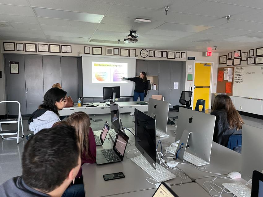
This week Creative Editor, Summer Foshee, ‘23, leads her Feather peers through a creative program called Canva, which she uses to create infographics, Jan. 19. In her presentation, Foshee discussed the importance of elements like color, text, graphics and sourcing your information.
Her seven deadly sins of infographics include:
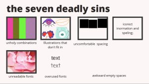
- Unholy color combinations
- Illustrations that don’t fit in
- Uncomfortable Spacing
- Incorrect information or spelling
- Unreadable fonts
- Overused fonts
- Awkward empty spaces
Foshee, who has been on The Feather for three years, has taken on the task of managing the site’s visual graphics and other creative elements. The position of Creative Editor has been created to match her skill set, strengths and develop her future aspirations. She looks forward to using her creative skills to help others publish stories.
As the Feather team develops their writing skills, the goal is to also train and become proficient in using various forms of digital media. Infographics are a great option when packaging articles for maximum reader engagement.
For more Feather photos visit the Feather Media page.
For more articles, check out Principal Amy Deffenbacher shares New Year’s encouragement and Community connections encourage help for Haiti.


