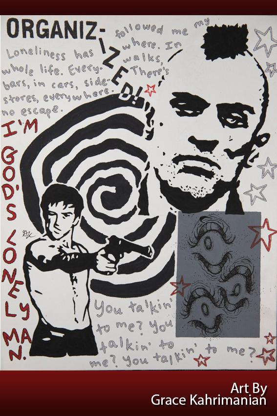
Acrylic painting by Grace Kahrimanian
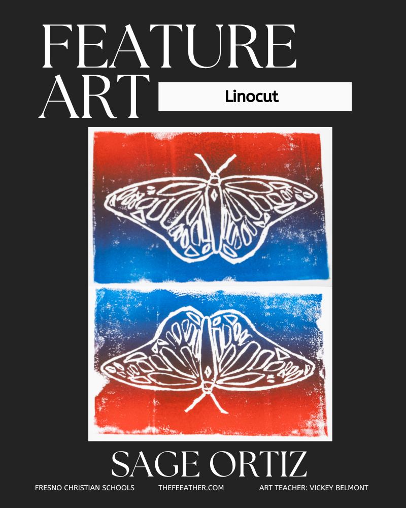
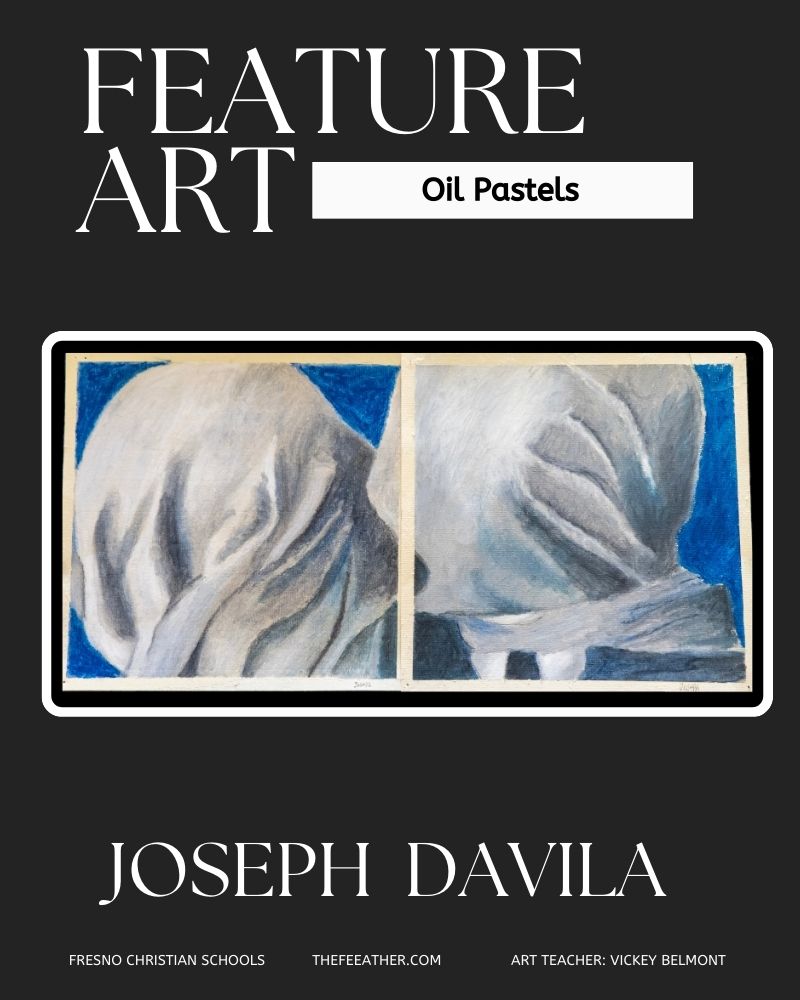
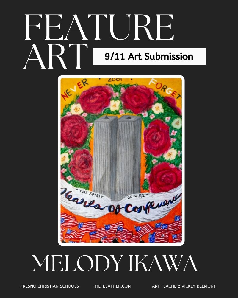
The Feather Featured Art series is chosen by art teacher Vickey Belmont from her classes and/or independent art students. Belmont picks the best work during current units and encourages students to participate in these occasional posts. Other students are encouraged to submit art pieces as well. Please contact the editors directly or via adviser Kori James for submissions.
Senior Grace Kahrimanian
As an Art 3 student Kahrimanian works independently on a personal portfolio piece.
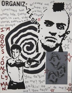
I made this piece using acrylic paint on a flat canvas. The painting features a head and half-body shot of Travis Bickle, the anti-hero protagonist of the 1976 psychological thriller-drama, Taxi Driver. I’m not even going to lie, I started the piece as a bit of a joke, mocking sigma-male culture and playing into something of an ongoing shtick that a couple of friends and I have about the whole sigma craze. I am fairly satisfied with the end result, though, much more than I anticipated I’d be.
I almost always incorporate some sort of text in the things I make and this time was no exception. I used a quote from the movie where Bickle claims that loneliness has followed him his “whole life. Everywhere. In bars, in cars, sidewalks, stores, everywhere.” He then dubs himself “God’s lonely man.” In the very top left section of the painting, you can see the word “organizized” spelled out. Now, this is no mistake. I’m quite aware of how to spell the word “organized,” thank you very much. In Taxi Driver, Travis talks to another character about how he needs to get organized. He tells her that he wants to get a sign that says “I need to get more organizized.” He then fails to land the joke with the woman he’s telling it to. Surprise, surprise. The use of eyes is also pretty consistent throughout my work. I think they’re creepy-looking. That’s pretty much my only explanation as to why I include them so frequently.
I pulled inspiration from a few different places for this painting. I was inspired by poster art I’d seen done for bands like The Cure and Siouxsie and the Banshees; this almost silhouette-type, shadowy style of portraying the piece’s subject. The music I’m listening to always plays a hand in determining the trajectory of the finished result of whatever it is I’m making. I listened to a lot of shoegaze bands while making this. I usually do while painting. I also listened to the Taxi Driver soundtrack, of course. It would only be fair considering the homage I paid to the movie via the subject of the painting.
Surprisingly enough, I didn’t have much trouble with this piece. I usually get hung up on a certain aspect of it or get stuck in a rut, but I didn’t this time. The placement of the different components was probably where I struggled the most. It’s hard to tell what’s going to look good next to what, because something might look great in your head, but could totally translate horribly onto the canvas. I help myself through this by drawing out a thumbnail of whatever I’m doing and playing around with it.
I’m glad I made this piece. I didn’t think much of it when I started. It popped into my head one day during art class because I didn’t know what else to do. Sometimes art can be stressful because of how much you want to create something that you, as well as others, of course, will enjoy and like. This one had no expectations attached so I found it relaxing to make. The way the acrylic paint glides so smoothly over the canvas is relaxing as well. I’d recommend it to anyone that would be willing to try. It does one well to remember that the art you make does not have to look “good.” Art is such a subjective thing and is perceived differently by different people. I personally think it’s more about enjoying yourself during the process of making it, rather than stressing over the final product’s appearance. Have fun with the things you make, and try not to compare your work to other people’s in a way that’s negative.
For more art articles, read Feature Art No. 1, 2022-23: Sculptures.


